Death to Minimalism
Buildings, logos, living rooms and now even Hogwarts are being sanded down until nothing distinctive is left. Minimalism won, and I'm tired of it. A case for detail, ornament, clutter and all the unnecessary things that give a place a personality.
Today, I don't want to talk about software.
No APIs. No distributed systems. No latency numbers. No arguments about whether something should be a microservice or just a function.
Today, I want to talk about something much more important.
Something that has been bothering me for a while.
Everything is becoming flat.
And I don't mean that literally.
I mean the world is slowly losing its unnecessary details.
Buildings are becoming cleaner. Logos are becoming simpler. Movies are getting polished into visual sameness. Apps look like they were designed by the same person. Houses are beige. Furniture is beige. Websites are white, grey and rounded.
Even the things that are supposed to represent history, culture or personality are being stripped down until they're almost impossible to distinguish from one another.
Minimalism won.
And honestly?
I'm tired of it.
Maybe I'm just getting older.
Maybe I'm finally developing opinions about things that don't affect my salary.
Maybe there is something happening in my brain where I now look at an old building and think:
"Why the hell don't they make things like this anymore?"
But I genuinely miss detail.
I miss things being a little excessive.
I miss things having personality.
I miss looking at something and discovering that somebody clearly went completely overboard making it.
Look at architecture from a few decades ago.
I'm not even talking exclusively about grand historical buildings like the Palace of Versailles or the Sagrada Família. Those are obviously extreme examples.
Look at ordinary buildings.
Old theatres.
Railway stations.
Government buildings.
Hotels.
Apartment blocks.
Shopping arcades.
There were cornices. Columns. Carvings. Balconies. Arches. Decorative windows. Textured walls. Patterns. Stonework. Weird little architectural decisions that probably served absolutely no practical purpose.
And that's exactly why I like them.
They weren't necessarily efficient.
They were expressive.
Take Mumbai's Chhatrapati Shivaji Maharaj Terminus.
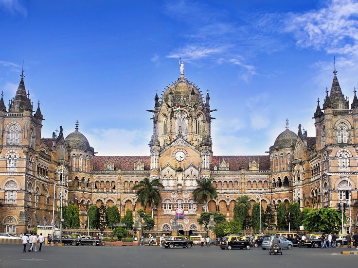
Look at the amount of detail on that building.
It isn't just a box where trains happen to arrive and leave.
It has layers.
Shapes.
Sculptures.
Windows.
Towers.
Stonework.
The building isn't simply saying:
"I am a building."
It's saying:
"Someone actually thought about how I should look."
And I think that's an increasingly rare thing.
Or look at the Taj Mahal Palace in Mumbai, photographed more than a century ago.
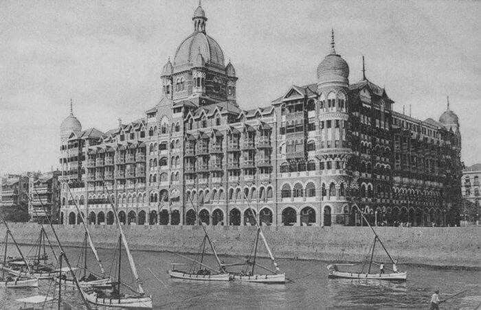
Even in a faded photograph from another century, the identity survives.
The building has a visual vocabulary.
It has a personality.
It feels like it belongs to somewhere.
Compare that with a lot of modern construction.
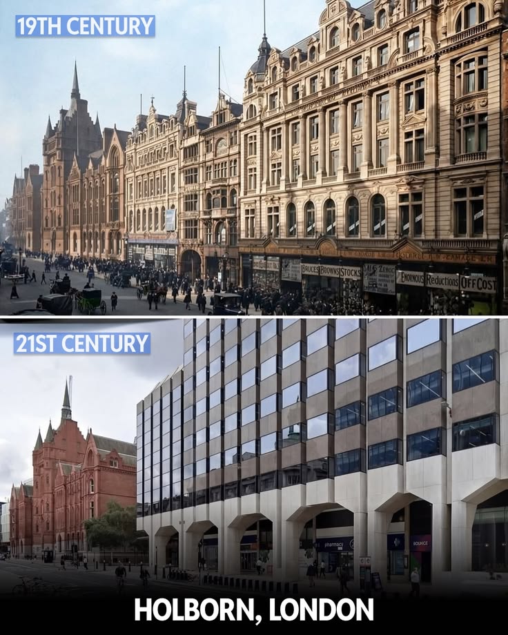
A lot of modern buildings seem to have been designed around one question:
"How do we make this as clean as possible?"
Straight lines.
Large windows.
Grey concrete.
White walls.
Black frames.
Maybe some wood if we're feeling adventurous.
And that's it.
Don't get me wrong.
Some modern architecture is fucking incredible.
There are architects doing genuinely imaginative things with modern materials and technology.
But the default has become boring.
We've collectively decided that the absence of detail is synonymous with good design.
And I'm not convinced anymore.
There is, of course, a practical reason for some of this.
Buildings are expensive.
Materials are expensive.
Labour is expensive.
Land is expensive.
Maintenance is expensive.
And nobody wants to spend millions maintaining decorative stonework when they could slap up a clean facade and call it contemporary architecture.
I get it.
If I'm building an apartment complex, I'm probably not commissioning someone to hand-carve every window frame either.
There is also a very real argument that modernist and minimalist design emerged partly because traditional ornamentation was expensive, labour-intensive and sometimes completely disconnected from the actual function of a building.
"Form follows function."
Fine.
But somewhere along the way, we started treating function as the enemy of personality.
And that's where I have a problem.
Because something can be functional and beautiful.
Something can be useful and excessive.
Something can be practical without looking like it came out of a software company's brand guidelines.
Architecture isn't the only place this happened.
Look at logos.
Over the last decade, companies have been taking beautifully distinctive logos and sanding them down until they look like they were generated by the same Figma template.
Remember when logos had personality?
Different typefaces.
Odd proportions.
Textures.
Shadows.
Colours.
Little quirks.
Now?
Remove the gradient.
Remove the texture.
Remove the weird typography.
Remove the unnecessary detail.
Make everything geometric.
Make it work at 16 pixels.
Congratulations.
You now have a logo that looks exactly like twelve other logos.
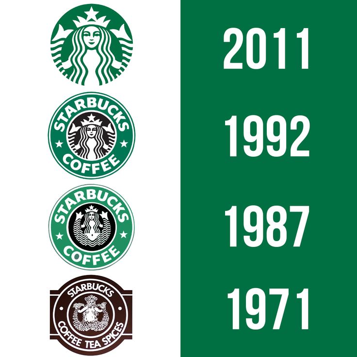
There's a reason this keeps happening.
Digital interfaces reward simplicity.
A logo needs to work on a phone.
It needs to work as a tiny app icon.
It needs to sit inside a browser tab.
It needs to work in black and white.
It needs to work on a billboard.
There are legitimate reasons for simplifying a brand.
But something interesting happens when every company follows the same logic.
Individual brands start losing their individuality.
You can see this particularly clearly in fashion.
In tech.
In automotive design.
In entertainment.
Everything starts looking like everything else.
And eventually, you get something strange:
simplicity becomes complicated.
Because when everyone is minimalist, being minimalist no longer makes you distinctive.
This is actually what made me want to write this.
I recently saw the house logos for the new 2026 Harry Potter adaptation.
And immediately I thought:
Why does this feel so... flat?
Now compare them with the original Harry Potter house crests.
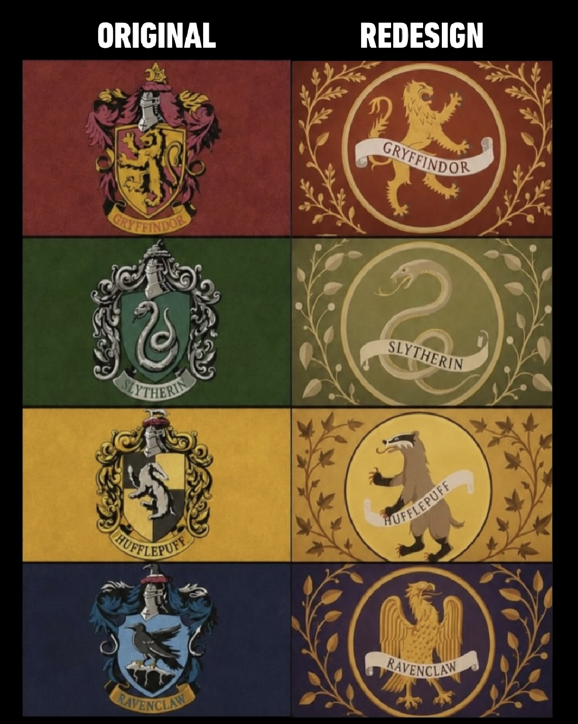
Look at the originals.
They're not just symbols.
They feel like crests.
They have texture.
They have heraldic language.
They look like something that could actually be hanging inside Hogwarts.
The lion, snake, badger and eagle feel like parts of an old magical institution.
There is weight to them.
History.
The new versions, at least from what we've seen, feel much more simplified.
Cleaner.
Sharper.
More contemporary.
And technically, they're probably better suited for modern branding.
But that's exactly the problem.
Why does Hogwarts need modern branding?
It's Hogwarts.
It's supposed to feel old.
It's supposed to feel like something that has existed for centuries.
Give me the unnecessary details.
Give me the weird typography.
Give me the elaborate crest.
Give me something that looks like someone spent an unreasonable amount of time designing it.
I don't want Hogwarts to look like a startup.
I want to make something clear here.
I don't hate simple design.
Some of the most beautiful things in the world are incredibly simple.
A plain white page can be beautiful.
A single line can be beautiful.
A perfectly proportioned building can be beautiful.
Minimalism itself isn't the villain.
The problem is when minimalism becomes the default answer to every design problem.
When every room has to be clean.
Every building has to be sharp.
Every logo has to be flat.
Every website has to have enormous whitespace.
Every product has to have rounded corners.
Every piece of furniture has to look like it belongs in a Scandinavian showroom.
Every colour palette has to contain six shades of beige.
At some point, we're not designing anymore.
We're following a template.
This extends beyond architecture and branding.
It extends into our homes.
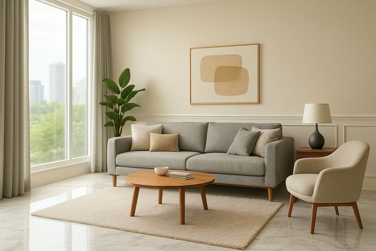
There's a particular kind of interior design that has taken over social media.
A giant room.
White walls.
A cream sofa.
A wooden coffee table.
One perfectly placed vase.
Maybe a plant in the corner.
A book sitting open on the table, presumably because someone wanted the room to look like a person lives there.
And that's the weird thing.
It doesn't look lived in.
It looks rendered.
Where are the books?
Where are the cables?
Where is the stupid mug you bought because it had a cat on it?
Where is the ugly lamp that somehow became your favourite lamp?
Where are the souvenirs?
Where is the random object you bought on a trip because you thought it looked cool?
Where is the evidence that an actual human being occupies this space?
I don't want my house to look like a showroom.
I want it to look like me.
I want objects that tell stories.
A ticket from somewhere I went.
A stupid little figure I bought because it made me laugh.
A poster I refuse to take down.
Books I've actually read.
Books I haven't read.
Something from a market.
Something from a friend.
Something that has absolutely no aesthetic relationship with anything else in the room.
That's the point.
We've become obsessed with the word clean.
Clean design.
Clean architecture.
Clean UI.
Clean room.
Clean branding.
Clean aesthetic.
But "clean" has slowly become a synonym for empty.
And those aren't the same thing.
A room can be full and still be beautifully designed.
A building can be decorated and still be elegant.
A website can contain personality without becoming unusable.
A logo can have detail without becoming illegible.
There is a huge space between:
"completely empty"
and
"absolute visual chaos."
Somewhere in that space is character.
That's the part I want back.
There might also be something psychological happening here.
Minimalism is safe.
A beige sofa isn't going to offend anyone.
A white wall isn't going to clash with anything.
A simple black logo isn't going to look ridiculous in five years.
A rectangular glass building isn't going to become the most controversial building in the city.
Minimalism reduces risk.
And companies fucking love reducing risk.
Because being distinctive means someone might hate what you've made.
But here's the thing:
If nobody hates it, there's a decent chance nobody loves it either.
Character requires some degree of risk.
The weird lamp might be ugly.
The colourful wall might look insane.
The ornate building might be considered excessive.
The strange logo might look dated.
But at least it is something.
Another reason I think minimalism became so powerful is that it became associated with luxury.
Look at expensive products.
Black.
White.
Metal.
Glass.
Soft lighting.
Huge amounts of empty space.
Everything carefully positioned.
Luxury became synonymous with restraint.
And I understand why.
It communicates confidence.
"We don't need to decorate this. The product itself is enough."
But that philosophy has leaked into everything.
Suddenly, the absence of decoration itself becomes a status symbol.
You don't need stuff.
You don't need colour.
You don't need patterns.
You don't need personality.
You have taste.
Except sometimes "taste" is just another word for having learned the same aesthetic rules as everyone else.
The funny thing is that I don't think minimalism is going to disappear.
Nor should it.
Design trends move in cycles.
Eventually people get bored.
They start adding colour.
Then patterns.
Then textures.
Then furniture starts getting weird again.
People start buying vintage things.
People start decorating their walls.
People start mixing styles that shouldn't technically work together.
And suddenly the thing that would've been called "too much" five years ago becomes cool.
We've already seen pieces of this happening.
Maximalism has returned.
People are embracing more colour and more personal interiors.
Vintage furniture is cool again.
People want spaces that feel collected rather than purchased in one afternoon from the same showroom.
And I think that's healthy.
Not because maximalism is inherently better.
But because choice is better than a default.
I want buildings with little details nobody asked for.
I want doors that are slightly more interesting than they need to be.
I want weird statues.
I want colourful walls.
I want patterns.
I want signs with personality.
I want restaurants that don't look like every other restaurant.
I want houses that tell me something about the people inside.
I want logos that I can recognise without reading the name underneath.
I want movie worlds that feel like they have existed before the camera arrived.
I want fantasy worlds that look old, not digitally polished.
I want things that look like someone cared too much.
Because that's what art is supposed to be.
It's supposed to be a little irrational.
It's supposed to be unnecessary.
Nobody needs a painting.
Nobody needs an ornate doorway.
Nobody needs a strange little sculpture sitting on a shelf.
Nobody needs a ridiculously detailed crest.
But that's precisely why we have them.
Human beings have always made things that they didn't need to make.
That's kind of the whole point.
So no, I'm not actually calling for the destruction of minimalism.
If you love your empty apartment with one chair, one plant and a bowl that somehow costs ₹8,000, please continue living your best life.
If you like clean architecture, good for you.
If you prefer a simple logo, fair enough.
I'm not coming for your beige sofa.
Probably.
What I am arguing against is the idea that simplicity is inherently superior to detail.
It isn't.
Detail can be beautiful.
Excess can be beautiful.
Imperfection can be beautiful.
Clutter can be beautiful.
Colour can be beautiful.
And most importantly, personality is beautiful.
I don't want a world where every building, website, logo, room and movie looks like it passed through the same machine designed to remove anything remotely unnecessary.
Give me the unnecessary.
Give me the weird.
Give me the excessive.
Give me things that make me stop and look twice.
Because the world is already full of things designed to be efficient.
Art doesn't need to be one of them.
Minimalism had its moment.
It gave us clean lines, beautiful restraint and a very impressive number of beige living rooms.
But perhaps it's time to let the pendulum swing the other way.
Bring back the clutter.
Bring back the colour.
Bring back the detail.
Bring back the things that make no practical sense whatsoever.
Death to minimalism.
Long live character.